In the previous articles in this series, I have discussed ways to make successful compositions using three and two primary subjects. Now we have arrived at one. One seems easy: just point your camera at your subject, right? On the one hand, photographing one subject has the advantage of being simpler than photographing multiple subjects. One the other hand, successfully creating a dynamic composition with just one primary subject can be difficult. As it turns out, one often isn’t quite enough; something more is needed.
Related article: Photo Composition Tip: Three is a Magic Number
Related article: Photo Composition Tip: It Takes Two
Three Dog Night had it right: “One is the loneliest number that you'll ever do.” But with these simple tips, you’ll find ways to do one right, and it won’t be so lonely after all—your one-subject compositions will have plenty of company from all the viewers who can’t tear their eyes away from your photos!
Look for “subjects within the subject.”
No matter what you are photographing, it is always a good idea to mentally “deconstruct” objects and subjects within your chosen composition, seeing them not in their entirety, but rather as a collection of abstract colors and shapes. This is especially helpful when working with single subjects.
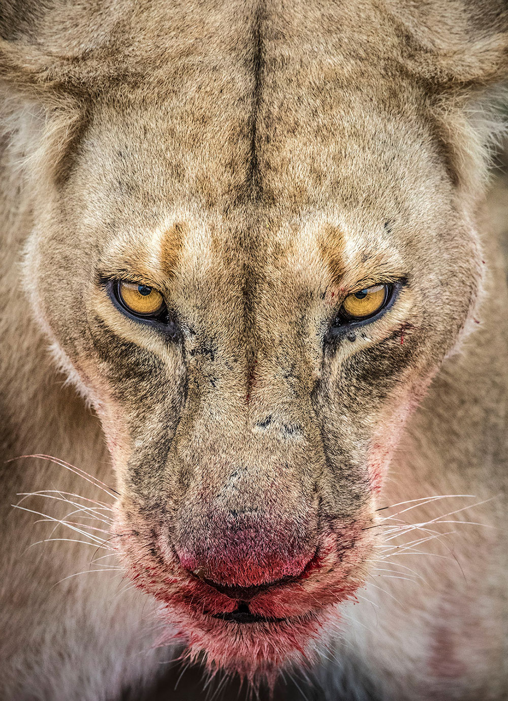
For example, with the portrait below, I don’t just see the face of the lion, but rather I see a bunch of individual shapes, colors, and patterns that collectively make up the lion’s face. At the very least, think of the lion’s face as two separate subjects—the left side and the right side—and imagine this to be a mirror image. As I mentioned in my article on photographing two subjects, when two similar objects are placed next to one another, the result is a symmetrical composition, which is what we have here with this lion portrait. Beyond symmetry, look for interesting shapes formed by parts of your subject, and use these to create compelling visual designs.
Get creative with positioning of your subject.
This technique is especially useful when working with a subject surrounded by a lot of empty space (also known as negative space). Think of this empty space as a secondary subject. By moving your primary subject off center, you can balance the subject against the empty space. Remember my discussion of counterpoint in the previous article? That’s exactly what is going on with this photo below of a polar bear cub surrounded by a frozen Arctic wilderness—except instead of one bear being used to counterpoint another bear, here, the cub in the upper right is visually juxtaposed against (more or less) empty space in the lower left. The resulting composition is more dynamic than if I had put the cub in the middle of the image frame.
Use background visual elements to enhance the composition.
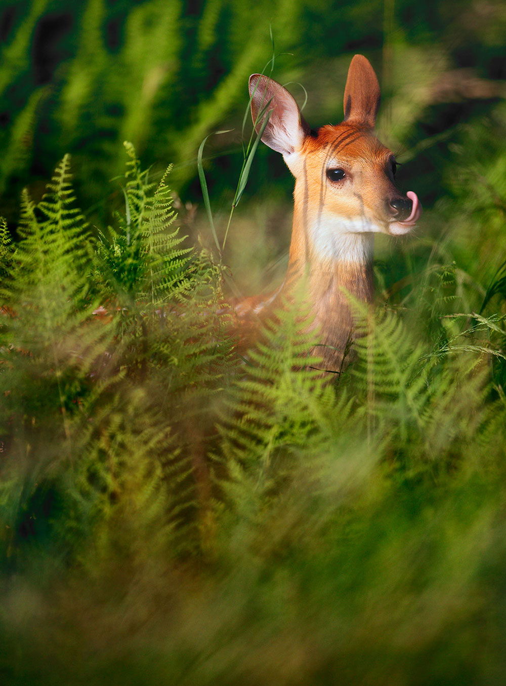
When you aren’t working with empty space, you’re likely to have a lot of secondary visual elements within your chosen composition. You can use the shapes they create to enhance your single subject compositions. For this photo of a fawn that I came upon in a field of ferns, I chose a composition that included lots of interesting texture and shapes from the surrounding undergrowth. I then waited for the moment when she licked her nose, adding an interesting curve shape to the composition—the icing on the cake! So, as it turns out, I ended up using all three techniques from this article for this photo, including creative positioning of the subject to add more energy to the composition.
Conclusion
Working with one primary subject is trickier than you might think, but if you are creative with your positioning, and include secondary elements to spice up your visual design, you can make effective and dynamic compositions.
Want to learn more?
If you are interested in taking your photos to the next level, then check out Visual Flow, my critically acclaimed eBook/video bundle on photographic composition. This is a great resource, but don’t just take it from me – here’s what others have said about it:
“Ian Plant has done the best job I have seen in explaining the secrets of good composition.” —Landscape Photography Magazine
“Visual Flow is one of the most comprehensive e-books I’ve ever read on the topic of composition. In fact, I would say this book might completely revitalize your photography.” —PhotoWhoa
“Ian Plant’s eBook Visual Flow: Mastering the Art of Composition belongs on the digital bookshelf of every serious photographer.” —PhotographyTricks.com
About the author: Managing Editor of Outdoor Photography Guide, world-renowned professional photographer, and Tamron Image Master Ian Plant is a frequent contributor to leading photo magazines including Outdoor Photographer, Popular Photography, and Landscape Photography Magazine. You can see more of his work and download his free photography how-to eBook “Essential” at www.ianplant.com.
Have something to add to the story? Leave a comment or email editor@outdoorphotographyguide.com.


Lol there you go with those songs again! I prefer BeeGees "One" but, hey, your blogs are always informative and great Ian, love reading them.